Everything You Need To Know About Forex Charts: Types And How To Read Them
Stock market price charts are like a cardiogram on a medical monitor: the more frequent the change, the more lively the market. But if you know where to look, the monitor will show much more: breathing rate, blood oxygen saturation, and blood pressure levels. It is the same with a chart in the forex market: it does not only show the rise or fall of the price.
You can follow trades in real-time on the charts. This allows you to make more informed buying and selling decisions and trade more frequently. To get the most information from the chart, you can adjust it by timeframe and by type of quotes displayed.
Types Of Forex Charts
Types of charts by time frame. You can track price changes in any time frame, from when an asset first hit the market to the current moment. Each point on the chart is a specific trading period. Usually, it is a month, week, day, hour, or minute. For instance, you can see how the price of an Apple stock traded each day last year: a line of 220 dots will appear on the chart (only weekdays are taken into consideration). These trading periods are called time frames.
Types of charts by type of display. You can display a time frame on a chart in different ways. This determines how much information you will see on the trading segment because the price can also be different:
- Opening price – how much the asset, stock, for example, was worth when the time frame started;
- Closing price – how much the stock was worth when the time frame ended;
- Minimum price – the cost of the cheapest purchase of the stock on the time frame segment;
- Maximum price – the cost of the most expensive purchase of the share in the time frame interval;
- Weighted average price – how much the stock was worth on average in the time frame interval.
There are at least a dozen different time frames displaying options in trading programs. For example, there are even such charts as Point and Figure and Renko. But they are not that often used by traders.
Still, we can distinguish three of the most popular: the line, the Japanese candlesticks, and bars.
Line Chart
This one is the simplest and most minimalistic chart. The line shows only one price value:
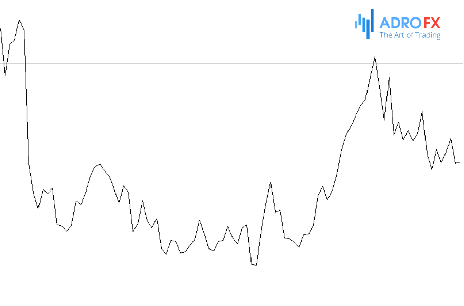
Usually, it is the closing price. If you open a chart of any asset and display it as a line - each point will show how much the stock was worth at the end of the time frame. In trading software, this value can be changed - you will have to go into the settings. Then one point on the line can show the opening price, the highest, the lowest, or the weighted average.
If you choose the chart as a line, you see only one price value and give up the rest of the information. Some believe that it is even better, while others believe that information should not be thrown around. If the latter opinion is closer to you, choose the Japanese candlesticks.
Japanese Candlesticks
The Japanese candlesticks contain five times more information than the line chart;
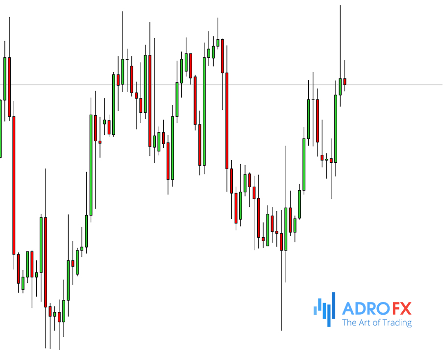
The volumetric part of the candle is called the body. The top of the body and the bottom of the body, depending on the outcome of the trading period means the opening and closing prices. To see this immediately, two ways are used:
One candle is colored, and the other is not. If a candle is colored in some color, it means fall, if it is transparent, it means rise.
Candles differ in color. The classic division is green and red. The green ones mean that the price has risen during the trading day, while the red ones mean that the price has fallen.
The thin part of the candle is called the shadow. The upper shadow is the maximum price, and the lower shadow is the minimum price.
The size of the body is the difference between the opening and closing price, and the size of the shadow - between the maximum and minimum price.
Bar Chart
Bars contain as much information as Japanese candlesticks but look different:
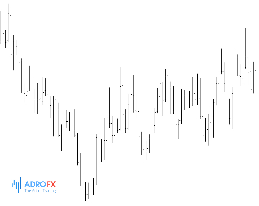
The upper point is the maximum price, and the lower point is the minimum. The opening price is shown with the bar on the left and the closing price with the bar on the right.
If the left bar is higher than the right one, it means that the price has fallen; if the right bar is higher than the left one, it means that the price has grown. This is the main difference from Japanese candlesticks: bars do not need colors to represent whether the price is rising or falling.
Trading Volume
In addition to displaying the price in time, the chart can display the trading volume - this is the total amount of all transactions in a particular currency (depending on the exchange) at the selected time frame.
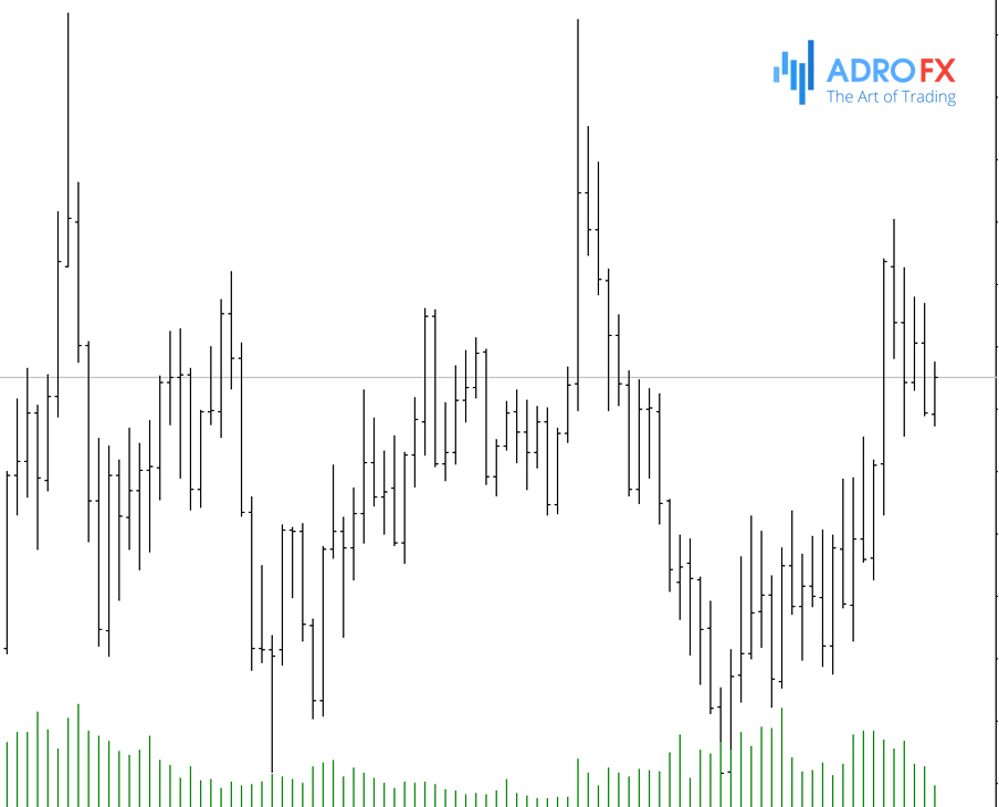
The trading volume shows liquidity – how easy it is to sell a product. If the asset is traded frequently, it means there are many buyers and it will be easier for you to sell it without losing the price. If it is rare, it will be difficult to find a buyer and you will most likely have to sell at a discount. For example, in the summer the volume of trades always drops.
Trading volume changes for a variety of reasons, but you can distinguish two main ones: when the market has an opinion on the future price of a stock and when big players urgently need funds.
- The bad or good news about a company always affects the stock price. If Meta Platform announces tomorrow that it has developed artificial intelligence that is smarter than humans, its stock will immediately go up. The opposite is also true when the former CEO of FTX was accused of fraud, and the company's stock plummeted the next morning. The news can be different (and not necessarily public), but if something significant happens to a company, investors immediately start trading its shares, thus expressing their opinion about the future price.
-
Sometimes large sales of shares are due to necessity. For example, a bank urgently needs capital: a lot of clients suddenly decide to withdraw their deposits ahead of time. The bank may be sure that the shares will only grow, but despite the potential earnings, it is forced to sell them to quickly find cash and return the funds to the depositors.
Why Do We Need Charts?
Trading on the financial markets is commonly divided into two strategies: investing and speculating. Depending on the strategy, the chart can be used in different ways.
Investors are called those who treat assets (stocks, indices) as an investment in a business. If the company develops, the stock price will rise. It takes time to develop, so you probably won't make a quick buck.
In investing, a chart is useful to get a general idea of the situation in a company: how the share price has changed, when there were periods of growth or decline, and for what amount of funds it is worth buying. For example, over the past five years, Apple shares have more than 260%: from $44 to $155 per share.
The volume will help to understand whether, if anything, you can sell the shares without losses or not.
Speculators are those who trade based only on price fluctuations. They think of how the price will change in the future. If the idea proves to be true, it is possible to earn on a fall or rise in the value of the asset.
In speculation, a chart is needed to find ideas and opportunities. For example, a bank needs to buy a lot of shares of one company. If they buy all of them in one day, they will have to overpay a lot: the supply in the market is limited, and a big purchase will drive prices up. So as not to make people nervous, the bank buys stock in small batches over several days or weeks until it finds the right amount.
The volume will help us understand whether this theory is worth following: it is believed that an average increase in trading volume over the day will determine such purchases. It is possible to assume that the bank is not done trading yet, the price will rise, and try to capitalize on that.
Yet, there are problems with the idea. First, if the volume of buying or selling an asset has increased, it may not mean anything - it's just coincidental. Second, ideas are always based on the past: if the price has fallen or risen in a certain situation before, it does not mean that it will change the same way now. This is just a statistic.

About AdroFx
Established in 2018, AdroFx is known for its high technology and its ability to deliver high-quality brokerage services in more than 200 countries around the world. AdroFx makes every effort to keep its customers satisfied and to meet all the trading needs of any trader. With the five types of trading accounts, we have all it takes to fit any traders` needs and styles. The company provides access to 115+ trading instruments, including currencies, metals, stocks, and cryptocurrencies, which make it possible to make the most out of trading on the financial markets. Considering all the above, AdroFx is the perfect variant for anyone who doesn't settle for less than the best.
Related Articles

Latest updates
Latest updates


Technical Analysis
Latest updates