Decoding Price Movements: The Essential Candlestick Patterns
Delving into the intricacies of candlestick patterns is vital for traders aiming to grasp market sentiment and forecast price movements accurately. Candlesticks, as visual aids in financial markets, offer a detailed portrayal of an asset's price dynamics over a specified period. This article aims to provide a comprehensive understanding of candlestick charts, from their fundamental components to interpreting various patterns, equipping traders with valuable insights for informed decision-making.
What Is A Candlestick?
A candlestick is a graphical representation used in financial markets to illustrate an asset's price fluctuations over time. Comparable tools include line charts and bar charts, all designed to show price movement.
Traders employ candlestick charts for technical analysis to forecast market movements with greater accuracy. By analyzing the color and shape of candlesticks, they can identify price trends and patterns under various market conditions.
Candlestick charts are utilized in all types of financial trading, including commodities, stock markets, indices, and forex trading. These charts display price data over specified periods, ranging from one minute to one day, depending on the chosen timeframe.
Now that we have a basic understanding of candlestick charts, let’s delve into reading them.
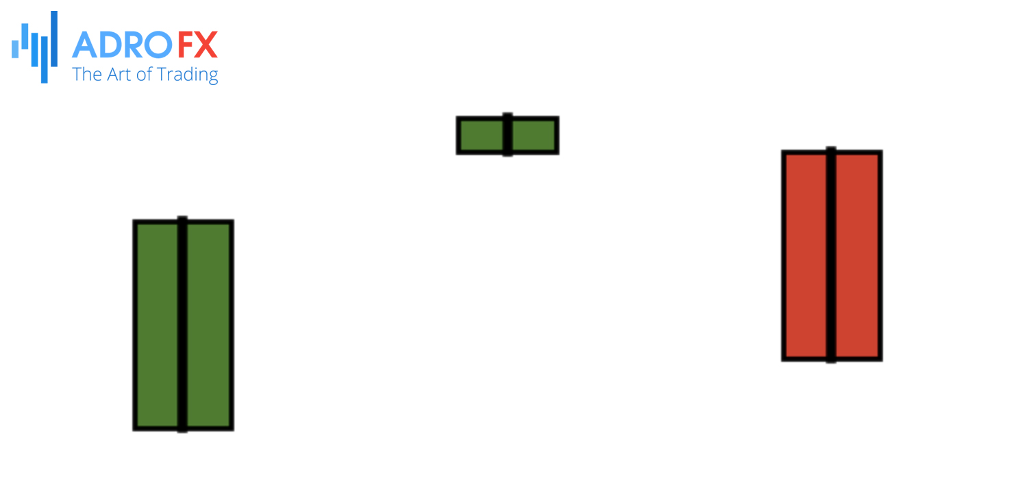
Each candlestick, whether red or green, can be interpreted as follows:
A candlestick reveals four key price levels during its session: the highest and lowest prices, and the opening and closing prices. To interpret candlestick charts, focus on the candle’s wicks, body, and color.
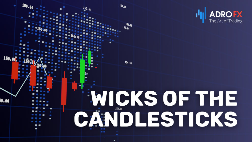
Wicks of the Candlesticks
The wicks (or shadows) of a candlestick represent the highest and lowest prices reached during its formation period. The upper shadow indicates the highest price, while the lower shadow indicates the lowest price.
A candlestick with a short lower shadow and a long upper shadow suggests that buyers were initially dominant, but sellers pushed the price down before the close, resulting in a lower closing price and a long upper shadow.
Conversely, a candlestick with a short upper shadow and a long lower shadow indicates that sellers initially drove prices down, but buyers regained control and pushed the price up before closing, resulting in a long lower shadow.
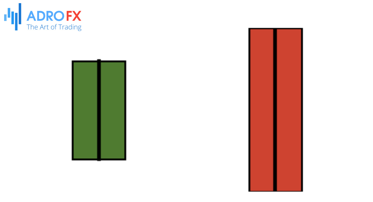
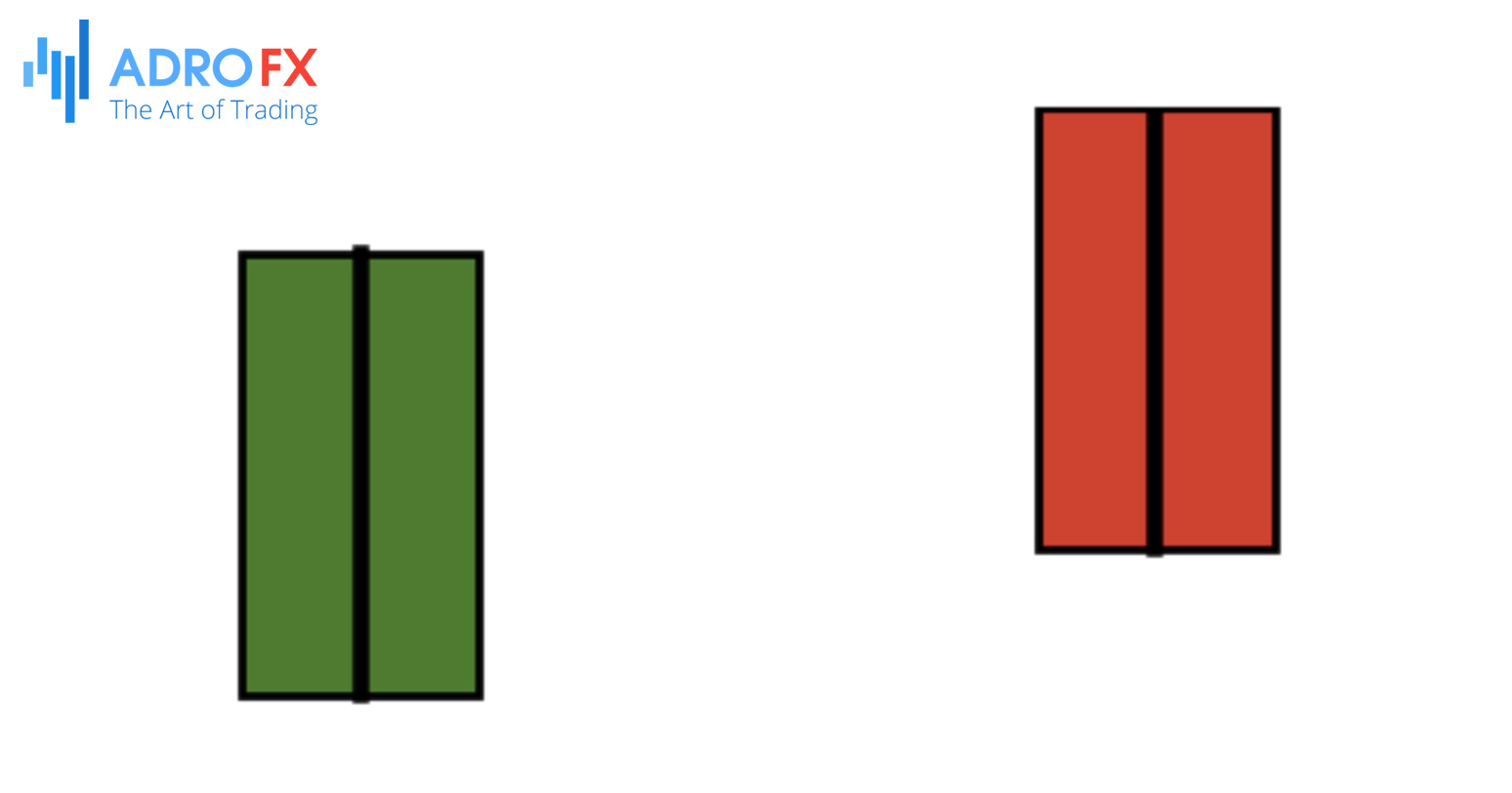
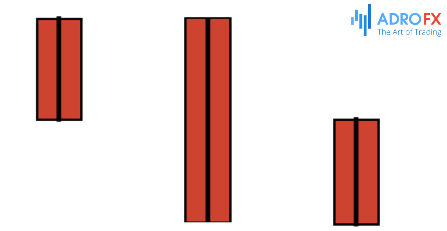
The Candlestick Body
The body of the candlestick shows the difference between the opening and closing prices. A green candle indicates that the opening price is at the bottom and the closing price at the top, signifying a price increase. A red candle indicates that the opening price is at the top and the closing price at the bottom, signifying a price decrease.
A long body signifies strong buying or selling pressure, while a short body indicates price consolidation during that period.
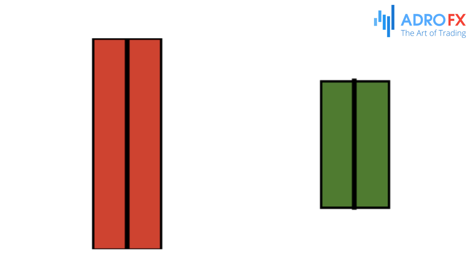
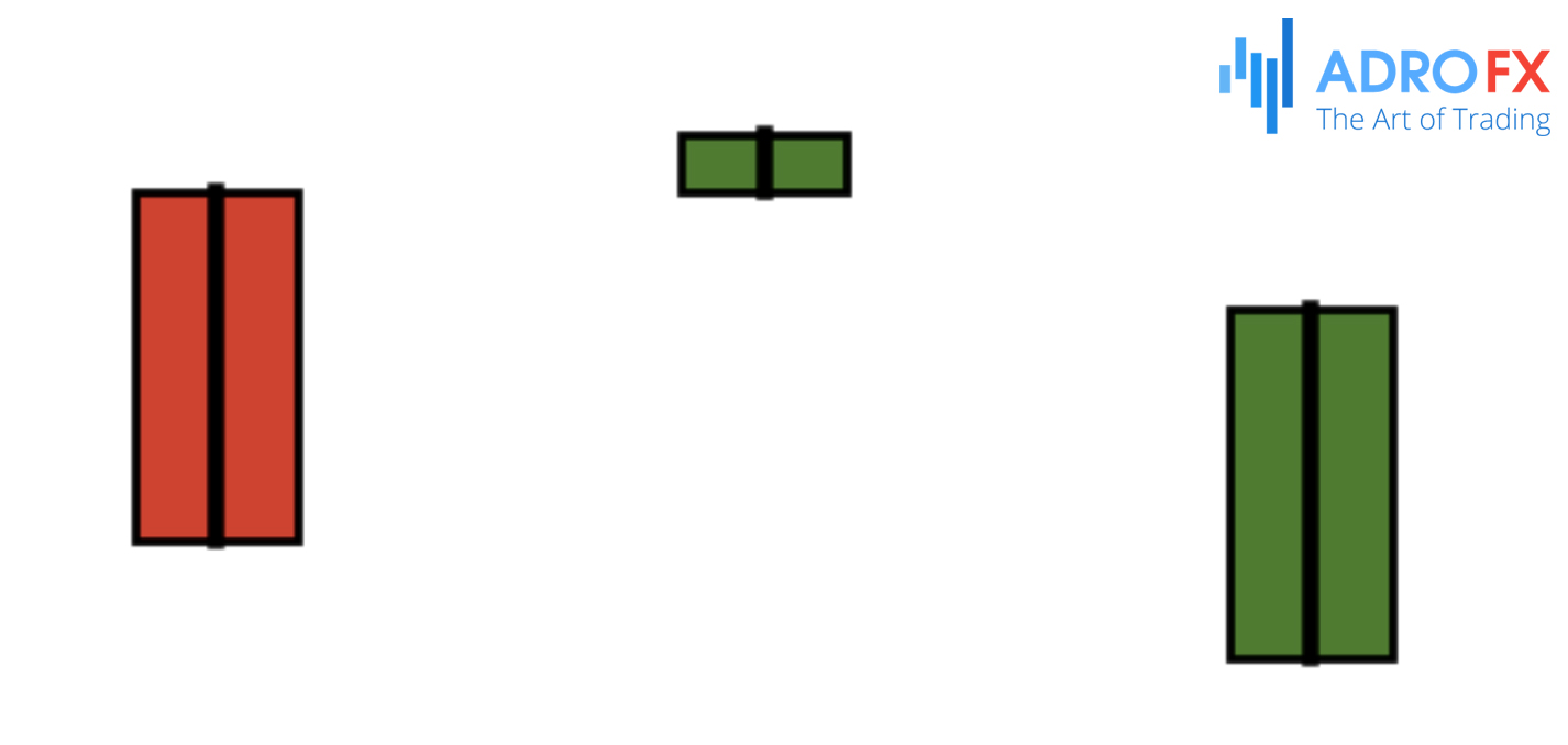
Color of the Candlestick
The color of the candlestick indicates the direction of price movement. A green candle means the closing price is higher than the opening price, indicating a bullish trend. A red candle means the closing price is lower than the opening price, indicating a bearish trend.
The recent candlestick colors help identify market trends. Candlesticks on the far right represent the most recent trading periods, while those on the far left represent older periods. The current candlestick will change color as prices fluctuate before the session ends.
Some traders prefer filled and unfilled candlesticks over red and green ones. Filled (black) candlesticks are similar to red, indicating a price decrease, while unfilled (white) candlesticks are similar to green, indicating a price increase.
Top Candlestick Patterns Everyone Should Master
In the forex market, traders utilize between 38 and 45 candlestick patterns to predict price movements. Here are the nine most effective patterns, as validated by experienced traders over time. These patterns are categorized into bearish and bullish types: bearish patterns suggest a likely price decline, while bullish patterns indicate a potential price rise.
Bearish Patterns
Bearish Engulfing Pattern
The Bearish Engulfing pattern manifests when a small green candlestick is succeeded by a larger red candlestick that completely engulfs the green candle’s body. This formation signals a potential reversal of an uptrend, indicating that sellers have seized control of the market, suggesting a likely decline in price. Traders consider this a strong bearish indicator, especially if it appears after a sustained upward trend.
Dark Cloud Cover
The Dark Cloud Cover pattern emerges when a red candlestick opens above the previous green candlestick’s close but then closes below its midpoint. This pattern signals a shift in market sentiment from bullish to bearish. The higher opening gives bulls hope, but the subsequent decline indicates that sellers have overpowered the buyers, leading to a potential downward price movement.
Evening Star
The Evening Star is a three-candlestick pattern that signals a bearish reversal. It comprises a large green candlestick, followed by a small-bodied candlestick (which can be either red or green), and then a large red candlestick. The small candle reflects market indecision, and the following red candle confirms that sellers are gaining control. This pattern is particularly noteworthy when it appears after an uptrend.
Three Black Crows
The Three Black Crows pattern features three consecutive long red candlesticks with short or no wicks, indicating strong selling pressure. Each candlestick opens within the previous day’s body and closes lower, demonstrating a steady decline in price. This pattern is a strong indicator of an impending bearish trend, showing consistent seller dominance over three trading sessions.
Bullish Patterns
Bullish Engulfing Pattern
The Bullish Engulfing pattern forms when a small red candlestick is followed by a larger green candlestick that completely engulfs the red candle’s body. This formation suggests a potential reversal of a downtrend, indicating that buyers have taken control of the market, and the price is likely to rise. It is regarded as a strong bullish signal, particularly if it appears after a prolonged downtrend.
Morning Star
The Morning Star is a three-candlestick pattern signaling a bullish reversal. It consists of a large red candlestick, followed by a small-bodied candlestick (which can be either red or green), and then a large green candlestick. The small candle reflects market indecision, and the subsequent green candle confirms that buyers are stepping in. This pattern is significant when it appears after a downtrend.
Three White Soldiers
The Three White Soldiers pattern features three consecutive long green candlesticks with short or no wicks, indicating strong buying pressure. Each candlestick opens within the previous day’s body and closes higher, showing a steady rise in price. This pattern is a strong indicator of an impending bullish trend, demonstrating consistent buyer dominance over three trading sessions.
Hammer
The Hammer pattern forms when a small green or red candlestick has a long lower wick and little to no upper wick. It appears after a downtrend and signals a potential bullish reversal. The long lower wick shows that sellers drove the price down during the session, but buyers managed to push it back up near the opening price, indicating that buyers are gaining strength.
Inverted Hammer
The Inverted Hammer pattern resembles the Hammer but has a long upper wick and little to no lower wick. It appears after a downtrend and suggests a potential bullish reversal. The long upper wick shows that buyers pushed the price up during the session, but sellers brought it back down near the opening price. Despite the sellers' efforts, the buying pressure suggests that a reversal might be imminent.
How to Utilize and Interpret Candlestick Patterns
Every aspect of candlestick patterns conveys information, but deciphering their message is a nuanced task. While the direction, color, and shape of candlesticks may sometimes seem arbitrary, more often than not, they form recognizable patterns.
One significant insight offered by candlestick patterns is the identification of support and resistance levels. These are crucial for traders seeking to validate their assumptions about price movements. However, it's essential to acknowledge that candlestick patterns have limitations. They cannot, for instance, explain why opening and closing prices differ or align.
Therefore, it's advisable to incorporate candlestick patterns alongside other trading methodologies, such as technical or fundamental analyses, to corroborate overall trend assessments.
What Is the Most Reliable Candlestick Pattern?
No trading strategy can accurately forecast future price movements with absolute certainty. However, according to Thomas Bulkowski's research documented in the Encyclopedia of Candlestick Charts, the three-line strike stands out as the most reliable candlestick pattern.
The three-line strike consists of three consecutive candles of the same color, followed by a candle of the opposite color that engulfs the previous three. For instance, if the market experiences three consecutive days of losses followed by a day of gains that surpasses the previous losses, it forms a bullish engulfing pattern, also known as a bullish three-line strike.
Despite being deemed the most reliable pattern, it's essential to recognize its limitations. Bulkowski's analysis indicates that the bullish engulfing pattern is correct approximately 65 percent of the time for bullish signals and 67 percent for bearish signals. Additionally, it is relatively rare in financial markets, which may diminish its practicality for traders.
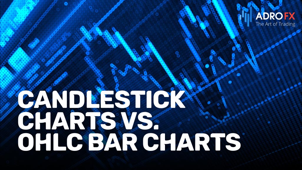
Candlestick Charts vs. OHLC Bar Charts: A Comparative Analysis
Candlestick charts and OHLC (Open, High, Low, Close) bar charts are two widely used methods for visualizing price data in financial markets. While both serve the purpose of illustrating price movements over a specified period, they have distinct characteristics and advantages.
Candlestick Charts
Candlestick charts offer a more visually intuitive representation of price action compared to OHLC bar charts. Each candlestick comprises four main components: the open, high, low, and close prices for the given period. The body of the candlestick represents the price range between the open and close, while the wicks (or shadows) indicate the highest and lowest prices reached during the period.
Traders frequently use candlestick patterns to identify potential market reversals, trends, and patterns. The color and shape of candlesticks provide valuable insights into market sentiment, aiding traders in making informed decisions.
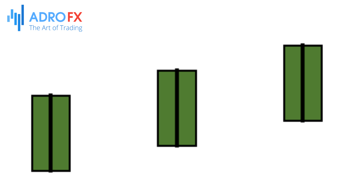
OHLC (HLOC) Bar Charts
OHLC bar charts display price data using four data points: the opening price, highest price, lowest price, and closing price for a specific period. Each bar consists of a vertical line extending from the high to the low, with horizontal lines indicating the open and close.
While OHLC bar charts provide the same essential information as candlestick charts, they might not be as visually intuitive for some traders. However, they offer a clear depiction of price levels and can be particularly useful for identifying key support and resistance levels.
Key Differences
- Visualization: Candlestick charts offer a more visually appealing and intuitive representation of price data, making it easier for traders to interpret market sentiment. In contrast, OHLC bar charts provide a straightforward depiction of price levels but may lack the visual appeal of candlestick charts.
- Pattern Recognition: Candlestick charts are particularly useful for identifying candlestick patterns, which can signal potential market reversals or trends. Although OHLC bar charts can also convey this information, candlestick patterns are more readily recognizable on candlestick charts.
- Support and Resistance Levels: Both chart types can help traders identify support and resistance levels. However, some traders may find OHLC bar charts more suitable for this purpose due to their clear depiction of price levels.
Both candlestick charts and OHLC bar charts have their advantages and are widely used by traders. The choice between them often depends on personal preference and trading style. Some traders may prefer the visual appeal and pattern recognition capabilities of candlestick charts, while others might favor the straightforward depiction of price levels provided by OHLC bar charts.
Conclusion
In conclusion, the analysis of candlestick patterns serves as a cornerstone for traders navigating the complexities of financial markets. By scrutinizing the color, shape, and arrangement of candlesticks, traders can uncover trends, anticipate reversals, and identify potential trade opportunities with greater precision. However, while candlestick patterns offer invaluable insights, it's imperative to complement them with other technical and fundamental analyses for a holistic comprehension of market behavior. Whether you're a seasoned trader or a novice, mastering candlestick patterns will undoubtedly elevate your trading strategy, empowering you to make well-informed decisions in the ever-evolving landscape of finance.

About AdroFx
Established in 2018, AdroFx is known for its high technology and its ability to deliver high-quality brokerage services in more than 200 countries around the world. AdroFx makes every effort to keep its customers satisfied and to meet all the trading needs of any trader. With the five types of trading accounts, we have all it takes to fit any traders` needs and styles. The company provides access to 115+ trading instruments, including currencies, metals, stocks, and cryptocurrencies, which make it possible to make the most out of trading on the financial markets. Considering all the above, AdroFx is the perfect variant for anyone who doesn't settle for less than the best.
Related Articles

Latest updates
Latest updates


Technical Analysis
Latest updates