Decoding the Dot Plot: Insights and Challenges in Interpreting the Federal Reserve's Monetary Policy Forecast

The dot plot produced by the Federal Reserve has gained immense attention and scrutiny in global financial markets. Since January 2012, the Fed has periodically updated this scatter chart, making it the unofficial forecast of the US central bank's monetary policy, whether intended or not. Additionally, it serves as a valuable source of insights into dissent within the Fed's policy-making committee, despite its cryptic nature and the challenges associated with interpreting it accurately.
Understanding the dot plot entails knowing what it represents, how to interpret it effectively, and also considering a critical perspective regarding its implications.
What Is the Dot Plot of the Federal Reserve?
The dot plot is a visual representation used by the Federal Reserve to display the projections made by each Fed official regarding the central bank's key short-term interest rate. Each dot on the chart represents the estimated midpoint of the federal funds rate as perceived by an individual central banker for the end of each calendar year, specifically three years into the future. These projections are based on the assumption that the economy will evolve as anticipated. Additionally, officials provide a dot representing the longer-run projection, which signifies the "neutral rate of interest" that neither stimulates nor hinders economic growth.
Each dot corresponds to a specific Fed official, including Chairman Powell, board member Lael Brainard, New York Fed President John Williams, and Chicago Fed President Charles Evans. The identities of the officials behind each dot remain anonymous to maintain confidentiality.
Under normal circumstances with a full staff, the dot plot consists of 19 individual projections.
However, if a member is absent from the Fed's Board of Governors, there will be one fewer dot on the chart. Additionally, St. Louis Fed President Jim Bullard has chosen not to include his own projections in the longer-run projections dot.
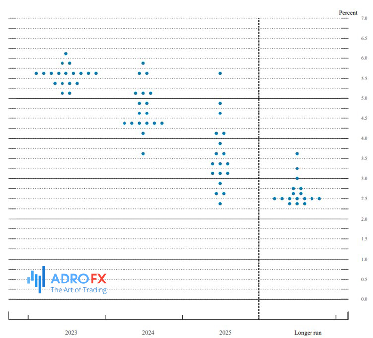
The Y-axis of the chart represents the federal funds rate, which is the interest rate at which depository institutions lend balances to each other overnight. The X-axis indicates the respective year for which officials have provided their forecasts, giving a timeline perspective to the projections.
How to Interpret the Fed's Dot Plot
The Federal Reserve's dot plot is a valuable tool for analyzing the central bank's stance. By examining the distribution of dots, one can identify clusters and gain insights into the overall bias of the Fed. For example, if there is a concentration of dots indicating expectations of higher interest rates, it suggests a generally more hawkish stance, even if the precise trajectory of rates is not yet determined.
In the most recent update as of March, the dot plot revealed that the largest cluster of five Fed officials projected the US central bank's benchmark interest rate to reach a range of 1.75-2 percent in 2022. However, seven officials anticipated rates to rise even higher than that range, while four expected a slightly less aggressive approach. This indicates a broad consensus among Fed officials leaning towards tighter monetary policy.
In terms of the longer-run projection, officials foresee the Fed funds rate stabilizing at 2.5 percent. Although this rate is typically consistent, it can change over time as officials update their forecasts based on factors such as inflation, unemployment, and economic growth.
While the dot plot may seem intricate, it can provide useful clues for individuals with high-yield savings accounts or carrying credit card debt, as it offers indications of where interest rates might be in the coming year or two, influenced by the officials responsible for these decisions.
However, it is crucial to recognize certain caveats. The future rarely unfolds exactly as the Fed expects. For instance, by the end of the July meeting, the Fed might raise interest rates above the previously projected target range of 1.75-2 percent for the end of 2022. Officials may act more swiftly than anticipated due to unexpected factors, such as inflation not slowing down as predicted.
Sarah House, director and senior economist at Wells Fargo, emphasizes that the dot plot represents officials' base case scenario, assuming that everything unfolds as expected. It is important to note that the situation can evolve rapidly, leading to adjustments in their outlook.
The Purpose Behind Creating the Dot Plot
The dot plot made its debut in 2012 under the Federal Reserve's guidance, coinciding with an economic recovery from the Great Recession and a period of near-zero interest rates. Its purpose was to offer valuable insights into the thought process of policymakers before they made official decisions regarding monetary policy. The Federal Reserve recognized that its communication had a significant impact on shaping investor expectations, often exerting more influence than the actual movements of interest rates themselves.
The introduction of the dot plot was part of a strategy known as "aggressive forward guidance," which was initially developed by former Chairman Ben Bernanke. The goal was to prepare the financial markets for the Federal Reserve's gradual shift away from the unconventional measures put in place to stabilize the economy. This approach sought to increase transparency and provide clear guidance regarding future policy actions.

Reasons to Approach the Dot Plot with Caution
The crucial question revolves around the extent to which interest rates will rise. Consumer prices have experienced a significant surge, reaching the highest annual level since December 1981 in May. As a result, the Fed has undergone a significant shift, with expectations of potentially larger rate hikes due to persistently high inflation. It is anticipated that officials will consider raising interest rates by three-quarters of a percentage point at their June meeting, marking the largest rate hike since 1994.
However, Federal Reserve Chairman Jerome Powell has emphasized the need for flexibility and responsiveness to incoming data. The dot plot, therefore, should not be viewed as a firm forecast or commitment, as interest rate projections are subject to change based on economic conditions and financial market developments. It is important to acknowledge that the dot plot can quickly become outdated due to its reactive nature.
Furthermore, the dot plot can be prone to misinterpretation or disregarded altogether. In December, Wall Street experienced panic following a seemingly hawkish post-meeting statement by the Fed, accompanied by a dot plot indicating two more rate increases in 2019. Despite Powell's emphasis on data-dependent decision-making, the meeting contributed to the worst December performance for stocks since the Great Depression.
Even within the Federal Reserve, officials have questioned the usefulness of the dot plot. Minutes from the January 2019 meeting revealed concerns among participants that the rate projections in the Summary of Economic Projections do not accurately reflect the Committee's policy outlook. Powell has acknowledged the potential for confusion caused by the dot plot while also acknowledging its potential as a constructive element of policy communication if properly understood.
The dot plot aims to increase transparency in the Fed's operations, allowing the public to see the range of views within the Federal Open Market Committee (FOMC). However, this inclusion of regional presidents who lack voting rights can introduce noise and make it difficult to ascertain the basis for each individual forecast. With only 12 voting members, the dot plot can create confusion and mixed signals, leading to debates on its usefulness.
Overall, while the dot plot provides transparency and insights into the Fed's thinking, caution is necessary when interpreting and relying on it due to the inherent complexities, potential for rapid changes, and the risk of misinterpretation or confusion it can generate.
Conclusion
The dot plot produced by the Federal Reserve is a closely scrutinized financial market chart that serves as the unofficial forecast of the US central bank's monetary policy. While it offers insights into Fed officials' thinking and reveals dissent within the policy-making committee, interpreting the dot plot requires caution due to its complexity and potential for misinterpretation. It provides projections of the Fed's key short-term interest rate, represented by individual estimates from each official. However, the dot plot should be seen as a base case scenario that can rapidly change based on evolving economic conditions. Despite aiming to increase transparency, the dot plot has limitations and can be misunderstood or disregarded, with even Fed officials questioning its usefulness. In conclusion, the dot plot offers valuable insights but requires careful interpretation due to its complexities and potential for misinterpretation.

About AdroFx
Established in 2018, AdroFx is known for its high technology and its ability to deliver high-quality brokerage services in more than 200 countries around the world. AdroFx makes every effort to keep its customers satisfied and to meet all the trading needs of any trader. With the five types of trading accounts, we have all it takes to fit any traders` needs and styles. The company provides access to 115+ trading instruments, including currencies, metals, stocks, and cryptocurrencies, which make it possible to make the most out of trading on the financial markets. Considering all the above, AdroFx is the perfect variant for anyone who doesn't settle for less than the best.
Related Articles


Latest updates
Latest updates


Technical Analysis
Latest updates